
2 posts tagged with "brexit"

View All Tags

ยท 3 min read
John Walley

We're currently working to simple annotations to our charts. I noticed that Flourish recently improved their support for adding annotations and thought that this would make for a good comparison.

The data for this chart comes from Google Trends and looks at interest over time in the search term "brexit".

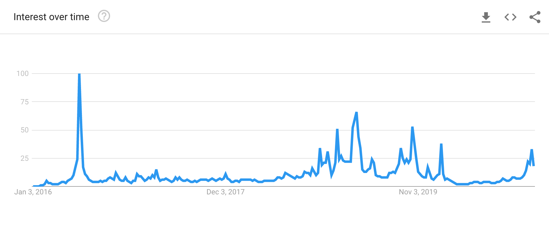
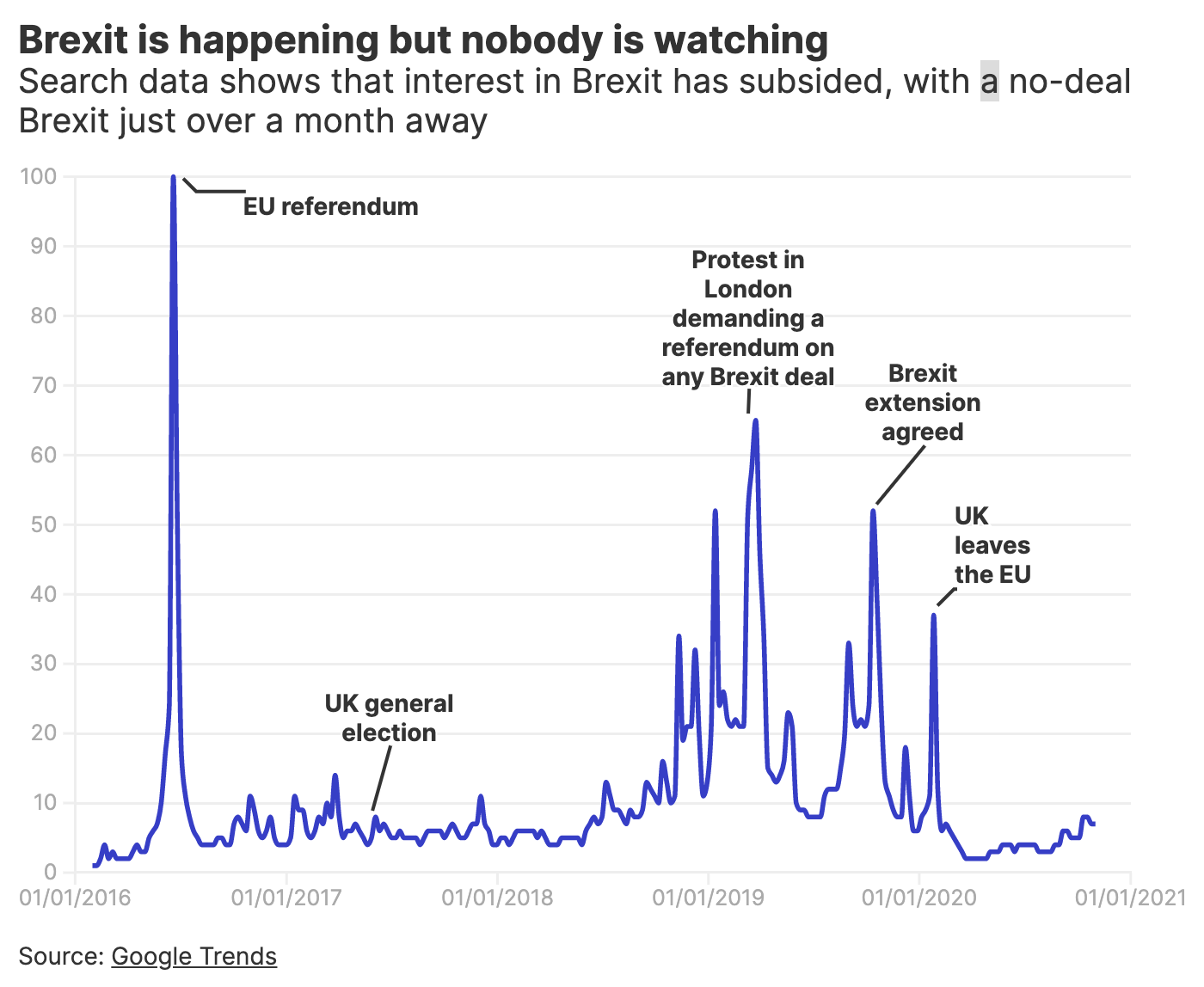
Google Trends does a fine job of showing the data in the chart above. What we'd like to do is highlight some significant dates for the reader.

Let's annotate

Here is the Flourish chart followed by the Remarkable Chart version.

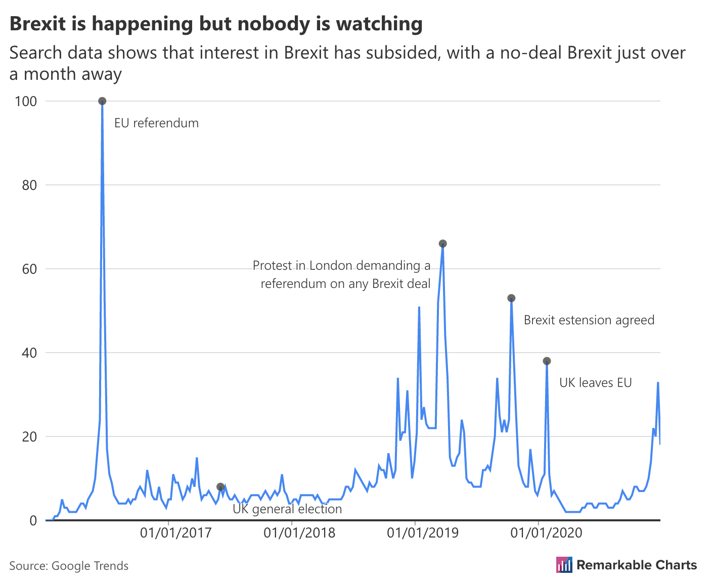
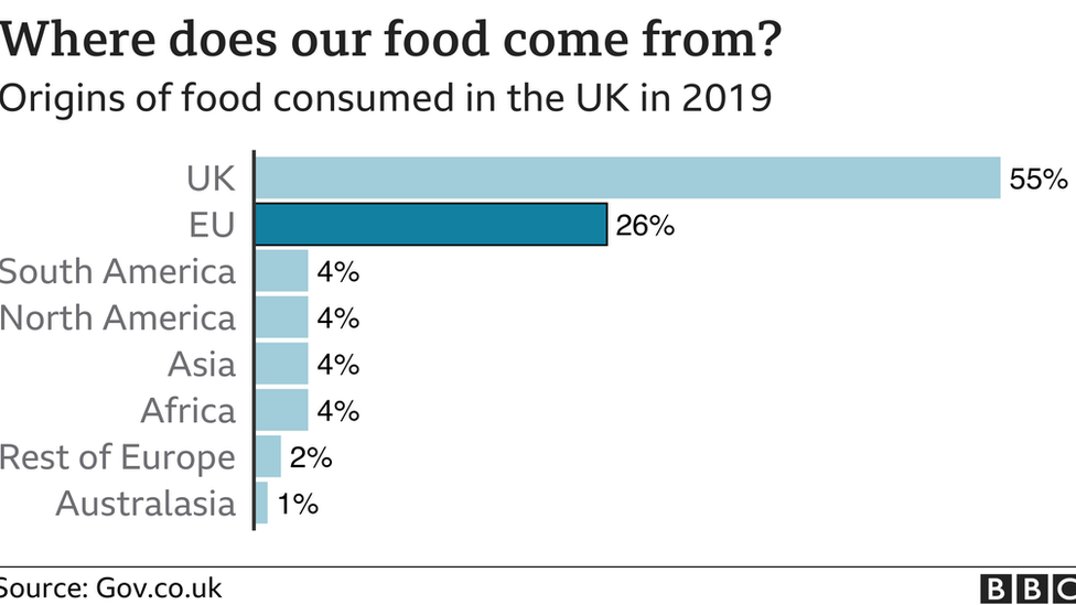
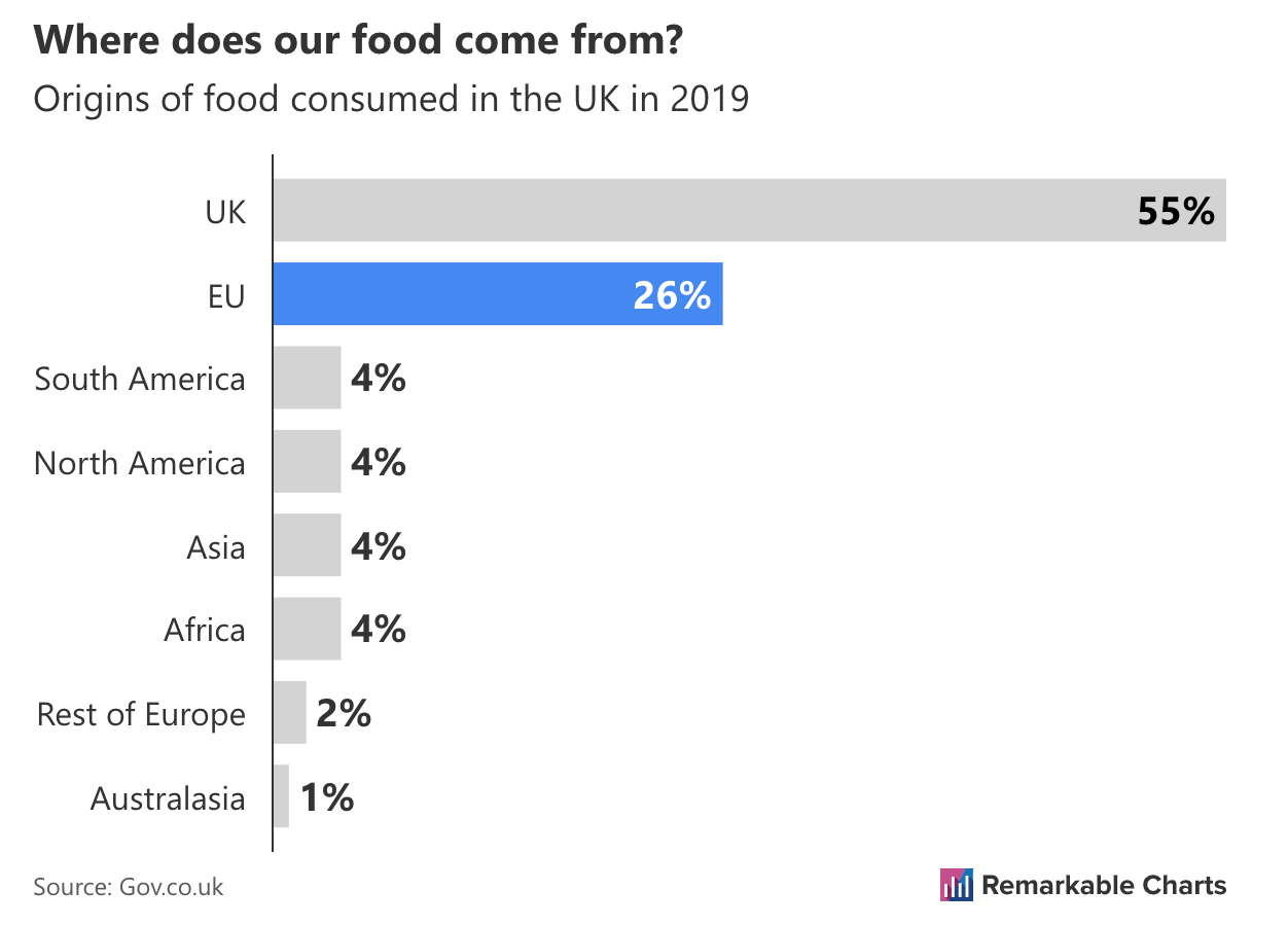
Straight away we can see the Flourish version is easier to understand, but in what ways?

ยท 2 min read
John Walley

On 1 January, Britain will stop following EU rules, and will have a new trade relationship with Europe. An article by BBC News discusses the effect on everyone's shopping basket.

Let's take a look at a chart featured in the article and reproduce it with Remarkable Charts.

Where does our food come from?

Unusually for the BBC the execution is sloppy. The image is cut off on the left and right edges. The source is also incorrect. There is no gov.co.uk, rather it should be gov.uk. However, let's ignore these issues and focus on what the chart does well.