
We're currently working to simple annotations to our charts. I noticed that Flourish recently improved their support for adding annotations and thought that this would make for a good comparison.
The data for this chart comes from Google Trends and looks at interest over time in the search term "brexit".
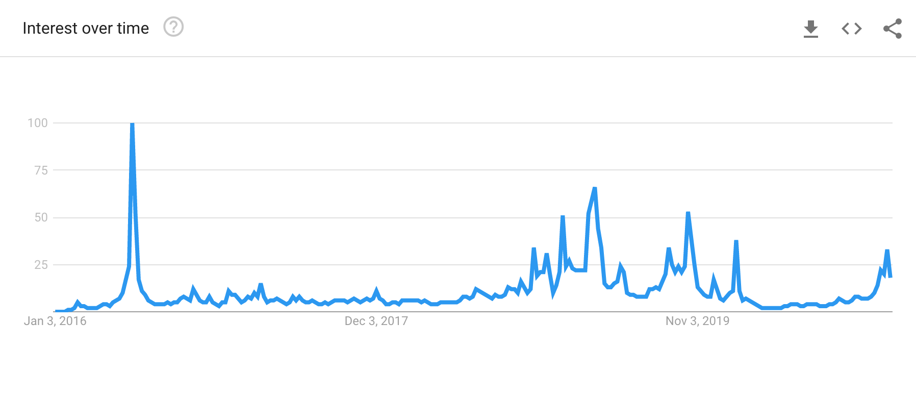
Google Trends does a fine job of showing the data in the chart above. What we'd like to do is highlight some significant dates for the reader.
Let's annotate
Here is the Flourish chart followed by the Remarkable Chart version.
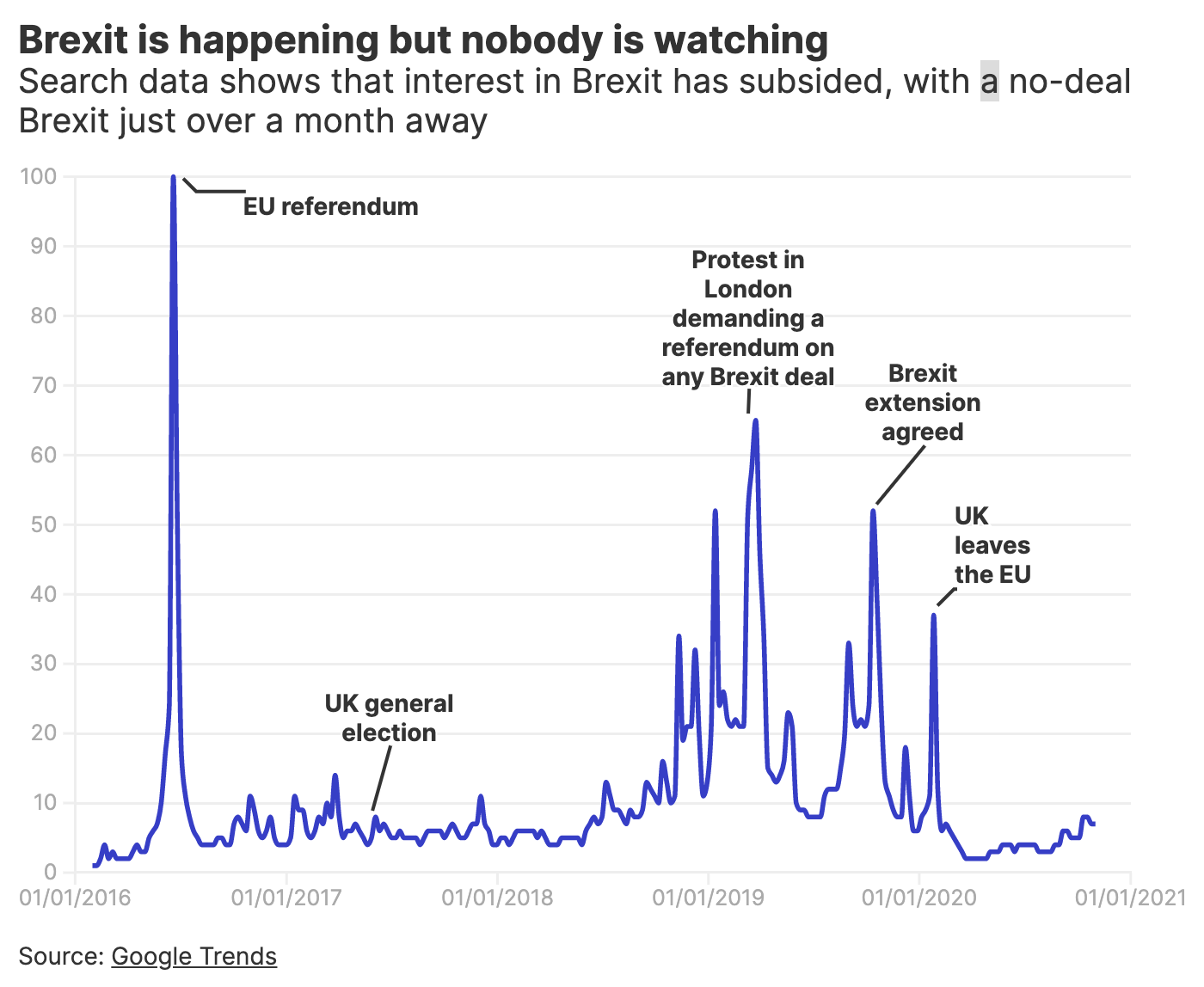
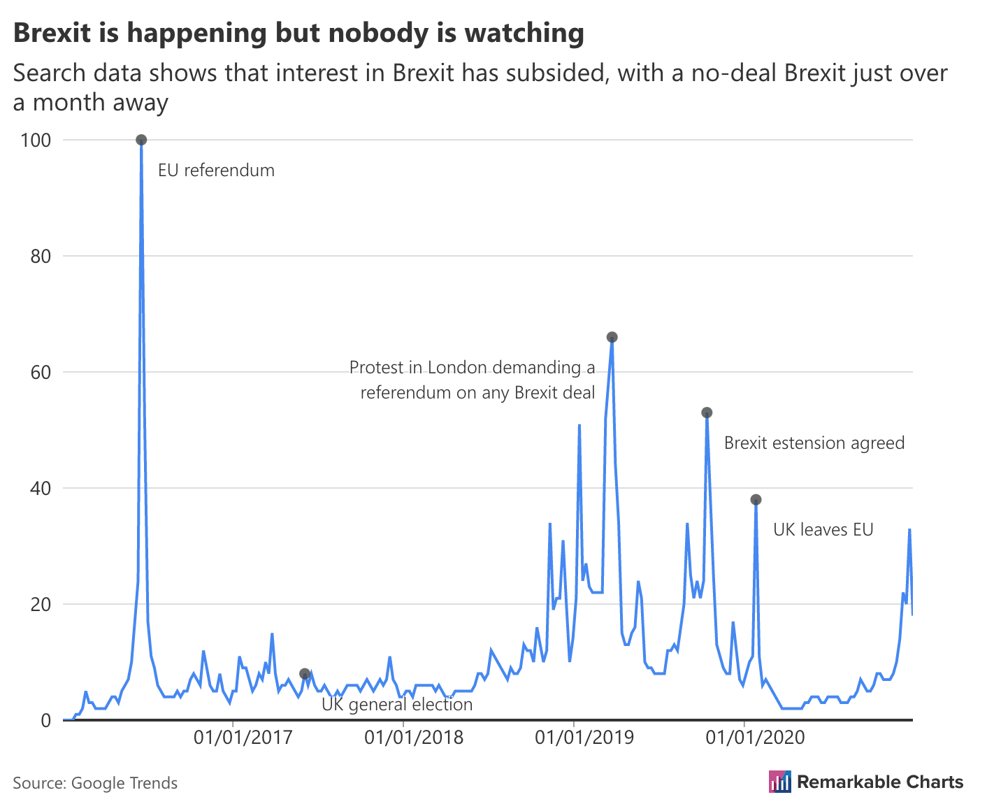
Straight away we can see the Flourish version is easier to understand, but in what ways?
We'll focus on the annotations for this post and the elephant in the room is the position of the annotation text. We're experimenting with automatic placement of annotation text at the moment. This has some advantages ofver purely manual placement, chiefly:
- less effort to create the annotation
- (possibly) more robust to the chart changing size
The big downside is that we may not be able to get it looking good every time!
Flourish asks you to position your text by hand (if the default below and to the right does not work for you). This is great because you can get the labels in exactly the place you want them. We can see the result in the chart above.
If we ignore the "UK general election" annotation then the Remarkable Chart seems ok. However, this is misleading. Specifically, we have no logic to avoid overlapping with the data. Here, the annotations are mostly associated with spikes in the data so the text avoids the line, but this won't work in general. You can see a good example of it not being ideal for the "UK general election" annotation. The text would be easier to read if it were above the blue data line.
Details
The text in the Flourish chart is larger and bolder which benefits legibility. It also draws the viewers eye to the annotations, which is usually what you want. The annotations tell the story and guide the viewer.
Next up we have a clear line connecting the text label to the data point. The Remarkable Chart has no connecting line and simply highlights the data point with a black circle. As it stands the text is sufficiently far away from the data point that it's not as clear as it could be which data point goes with which label.
Ideas for improvement
Let's distill our observations into questions for the development team to consider...
Improve automatic label placement
Easy to say but difficult to do well. That said, I think we can do better.
Offer manual label placement
There will always be cases where the automatic placement is unsatisfactory. Can we let the user choose the position themselves?
Make the label text stand out
Make the annoations the stars of the show.
More closely associate data points with text labels
A viewer shouldn't have to think in order to see which labels goes with which data point. How can we make this easier?