
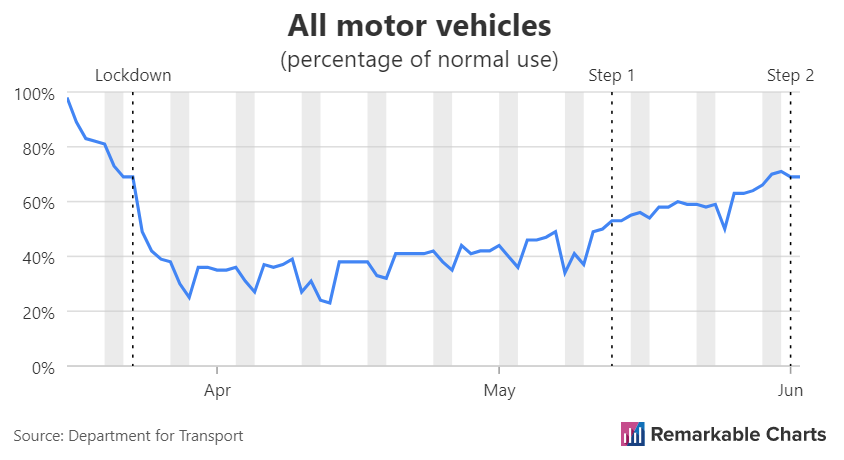
Last time we looked at reproducing this chart showing the change in transport use in the UK.
![]()
Here is our first attempt.
And here is the latest version.
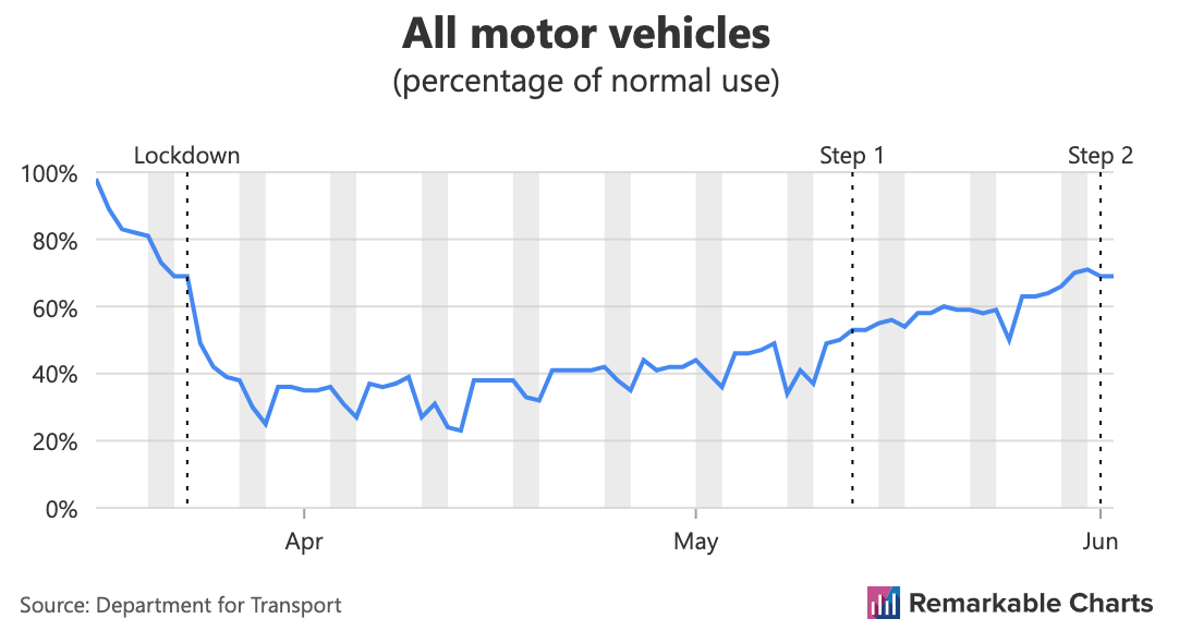
So... not a lot has changed. We've done some work behind the scenes on the key event labels above the chart. In particular, they should handle longer labels more gracefully by splitting over multiple lines.
Our main focus last time was trying to work out where exactly the grey rectangles should start and stop. For this chart it felt right to start between data points. This means that the area contains exactly the two data points corresponding to the weekend.
We went away and thought about this. For examples like the one above where there data points are regular (every day) it makes a lot of sense. But what about charts where the data points are irregular? There might be no easy to define concept such as 'daily' or 'yearly' to use.