
On 1 January, Britain will stop following EU rules, and will have a new trade relationship with Europe. An article by BBC News discusses the effect on everyone's shopping basket.
Let's take a look at a chart featured in the article and reproduce it with Remarkable Charts.
Where does our food come from?
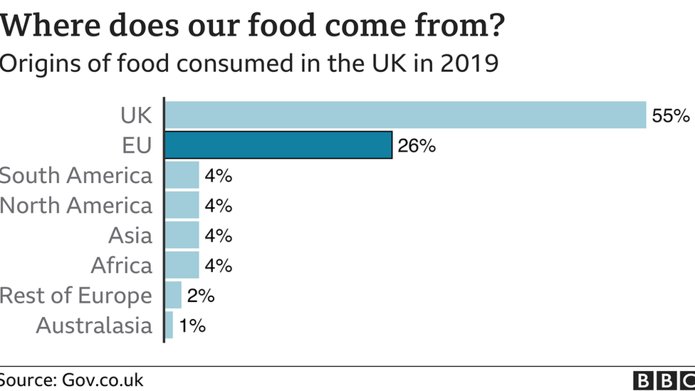
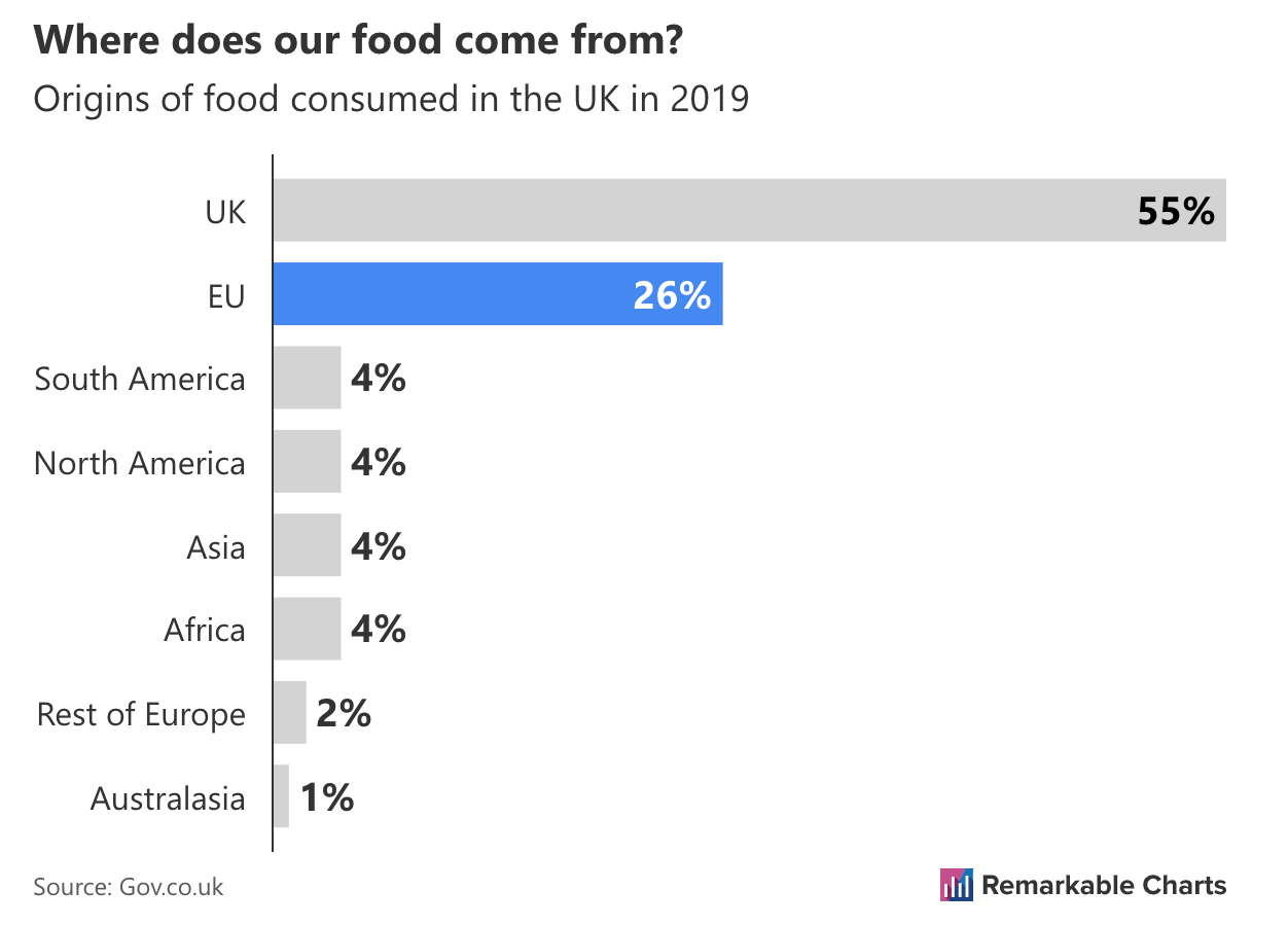
Unusually for the BBC the execution is sloppy. The image is cut off on the left and right edges. The source is also incorrect. There is no gov.co.uk, rather it should be gov.uk. However, let's ignore these issues and focus on what the chart does well.
The BBC title is more attention grabbing, mostly due to it being larger. It takes up more of the vertical space than our version which creates a more balanced look.
On a side note, BBC News switched to a serif typeface recently for some of their typography and, while it takes getting used to, I'm a fan. We don't currently support different fonts but it's certainly something we intend to get around to. Perhaps a quick win would be to let you switch between a sans-serif and serif typeface?
The standout difference is the two colour schemes. The BBC use a single colour across the bars and differentiate the highlighted bar by using a faded version of the colour for the other bars. In the Remarkable Chart the highlighted bar has its normal colour, and the other bars are in grey. The colour against grey makes the highlighted data point jump out. But is it appropriate here?
A few smaller details caught my attention:
- the selected bar has a black outline to further differentiate it
- the gap between bars is smaller
- the label (e.g. 55%) is always in a consistent place (just past the end of the bar)