
The daily UK government Coronavirus briefings usually feature a set of slides. These slides and the datasets used to produce them are made available to the public.
Let's take a look at a chart contained in the slides and try out best to reproduce it in Remarkable Charts. We're still in the development phase so this is very much a work-in-progress but this type of comparison is one of the key ways we ensure the quality of the product is up to scratch.
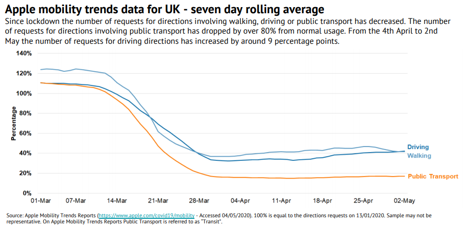
Apple mobility trends data for UK
This chart looks at the how people are getting about. It uses the number of requests for directions as a proxy for activity.
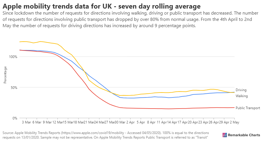
Overall, these look similar. I would pick out the following as areas the Remarkable Charts version falls down.
- Text is too thin, light and small
- Too few horizontal grid lines making it hard to pick out specific values
- No way of telling Driving and Walking lines apart
Let's dig into these in more depth and see if we can make some improvements.
Text is too thin, light and small
Take a look at the percentage label for the y-axis. The screenshot has been resized to fit on this blog post so the text on both charts is not as crisp as it could be. However, the original version is still much easier to read. It is bolder, darker and slightly larger - all of which aid legibility.
The same criticism can be levelled at the subtitle, axis tick labels, line labels and even the source attribution at the bottom.
I would describe this as a serious accessibility problem. It's something we take seriously so we'll prioritise fixing this.
Too few horizontal grid lines making it hard to pick out specific values
Two points to make here. The first is that we should choose to show more horizontal grid lines in this case. Every 20% as in the original makes sense and doesn't look cluttered. The second point is that there is no gridline above the lines in our chart. Why is this important? It helps the reader get a feel for what the peak is. In the original we know the peak falls between 120% and 140%. We just can't say anything about it in ours.
No way of telling Driving and Walking lines apart
The lines representing Driving and Walking finish close together. This makes the labels potentially ambiguous. This is definitely the case in our chart. The original is better in that the labels can be distinguished by colour.
So what now?
We'll feed these observations back into development and get to work on them. Check back in a few days to see the results.