Here is the from page of the Independent newspaper from the 31 July 2020.
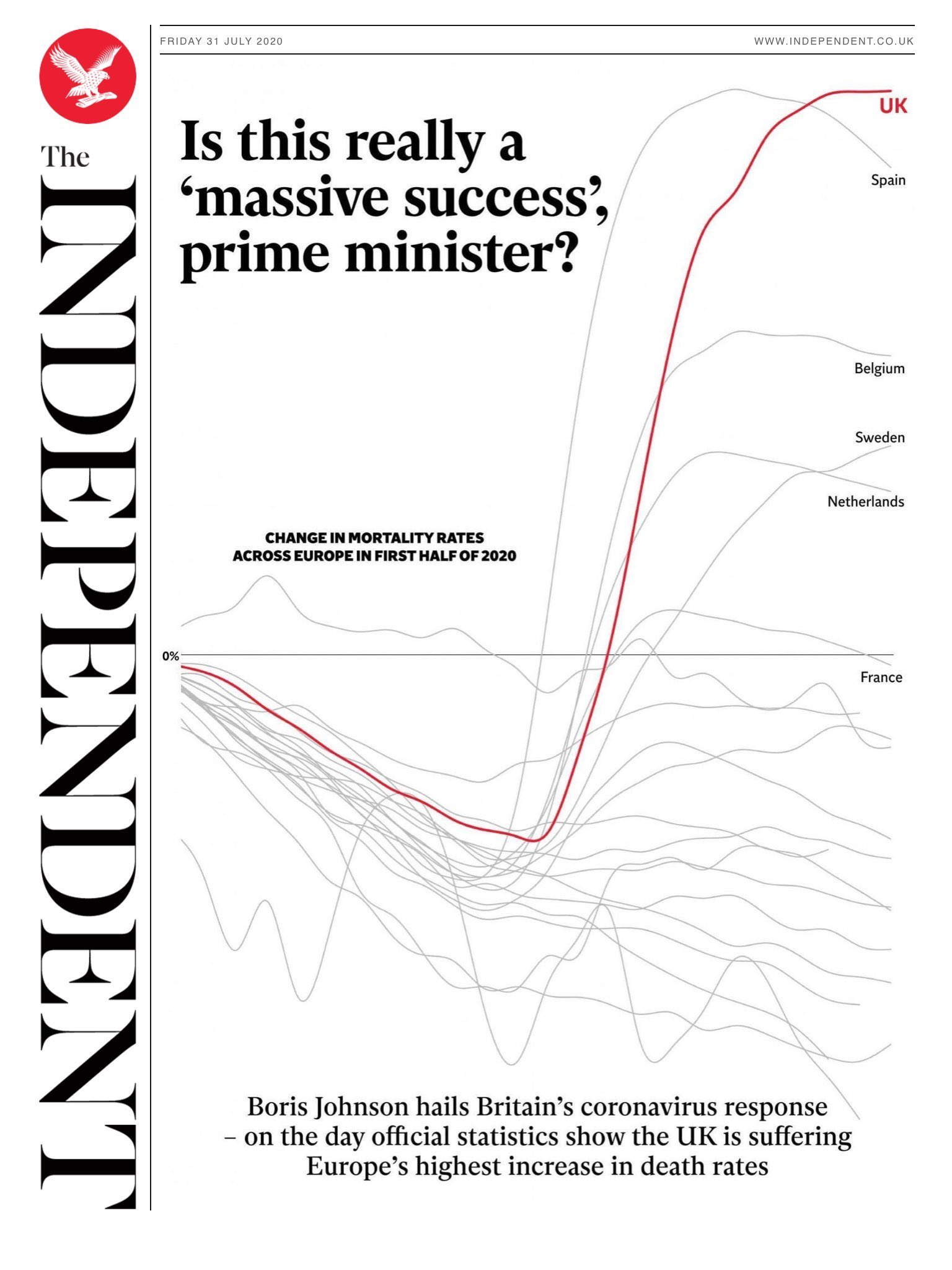
Here is our reproduction.
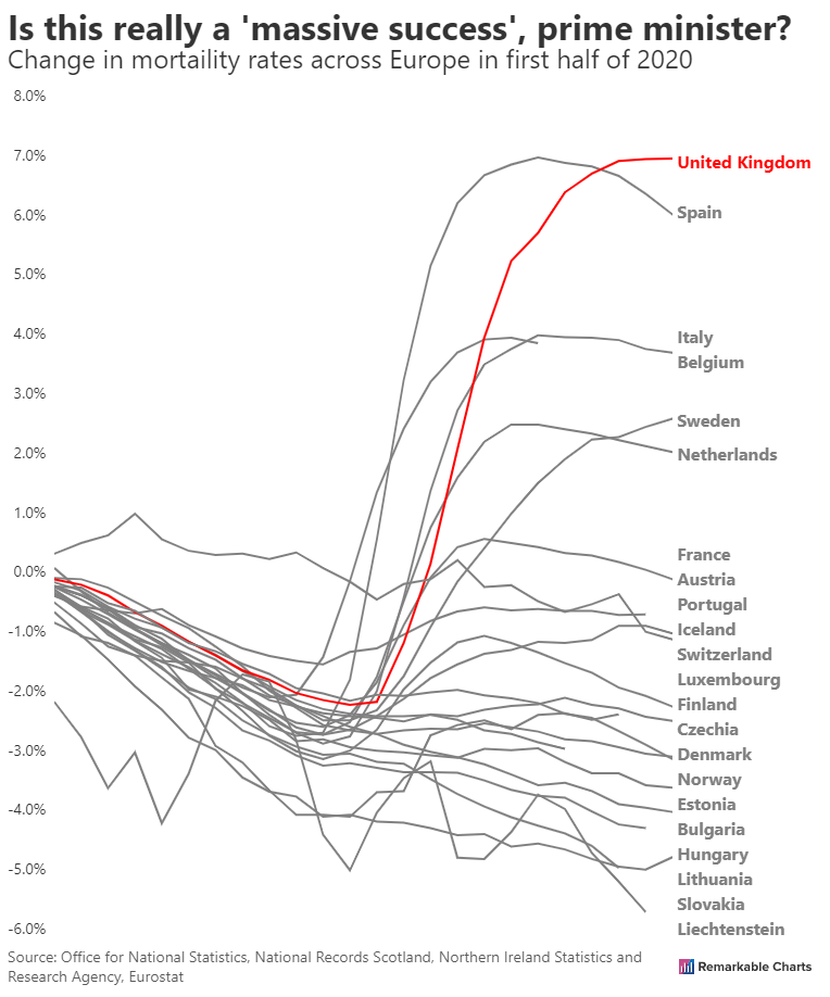

Last time we looked at reproducing this chart showing the change in transport use in the UK.
![]()
Here is our first attempt.
And here is the latest version.
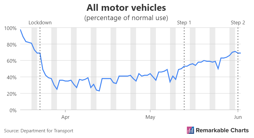
The daily UK government Coronavirus briefings usually feature a set of slides. These slides and the datasets used to produce them are made available to the public.
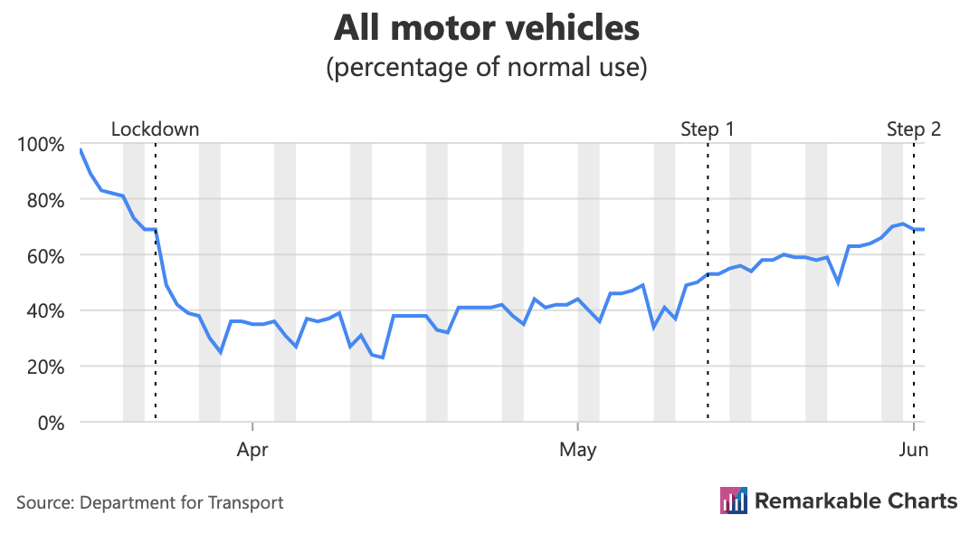
This will be our second look at reproducing a chart from the slides with Remarkable Charts. The chart shows the change in tranport use for motor vehicles in Great Britain. It's one of five charts on one slide showing various forms of transport. Thefore the original is quite small and makes for a pixelated screenshot.
![]()
We're currently working on adding annotations to our charts and this is a great example. Immediately we can see where lockdown started, as well as the start of the easing of restrictions (step 1 and step 2). We can also see additional infromation conveyed by the grey bands behind the chart. These represent weekends and we can see traffic dropping during some weekends.
Here is our reproduction.
Last time we looked at recreating a chart from the UK's daily coronavirus briefings. We identified a few issues with our recreation and now we can look at if we've been able to address them.
As a reminder here is the original chart.
The daily UK government Coronavirus briefings usually feature a set of slides. These slides and the datasets used to produce them are made available to the public.
Let's take a look at a chart contained in the slides and try out best to reproduce it in Remarkable Charts. We're still in the development phase so this is very much a work-in-progress but this type of comparison is one of the key ways we ensure the quality of the product is up to scratch.
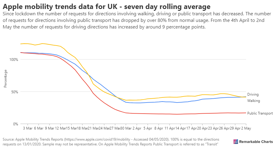
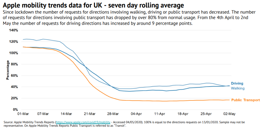
This chart looks at the how people are getting about. It uses the number of requests for directions as a proxy for activity.