
Here is the from page of the Independent newspaper from the 31 July 2020.
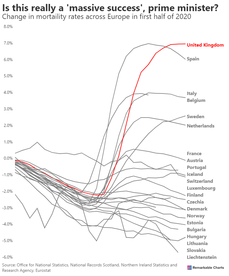
Here is our reproduction.
What jumps out at us, and what can we improve, with our annotations?
Chart junk
Chart junk is any element of a chart that does not contribute to clarifying the intended message.
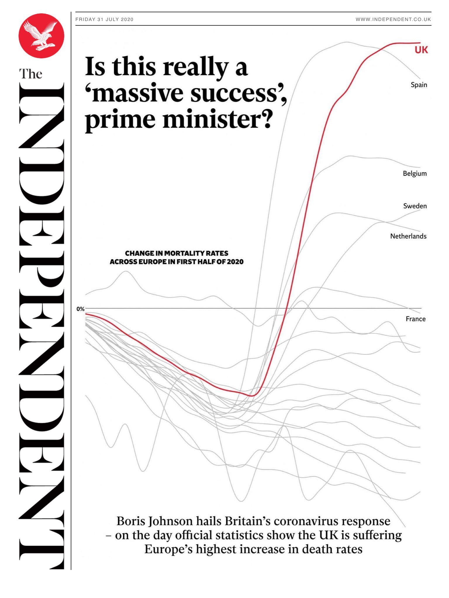
The main piece of information that the Independent chart disposes of is the y-axis scale. All we get is a line showing us where 0% is. This could be used to mislead, if for example the magnitude of the changes were very small. This isn't the case here (assuming 8% is a signigicant change) and I can be convinced that it's acceptable for a chart on the front-page of a newspaper.
The second piece of information which is missing is the identity of most of the countries. The Independent chart picks out the six highest countries.
It's unclear to me how we could provide either of these options to the user in a simple manner. Let me know if you havbe any ideas!
Missing zero line
That said, we don't currently draw a horizontal line representing 0. We should!
Fading into the background
The lines corresponding to other countries are much fainter in the Independent chart. I appreciate this touch and it's something we can mirror.